
Accessible Documents
Readable fonts
- Use sans serif fonts, such as Karla as letters can appear less crowded. Alternatives include Ariel, Verdana, Tahoma, Century Gothic, Trebuchet, Calibri, Open Sans.
- Font size should be 12-14 point or equivalent (e.g. 1-1.2em / 16-19 px). Some dyslexic readers may request a larger font.
- Avoid underlining and italics as this can make the text appear to run together and cause crowding. Use bold for emphasis.
- Avoid text in uppercase/capital letters and small caps, which can be less familiar to the reader and harder to read.
- Ensure that the title and contact details are in clear, large, lowercase print
- Larger inter-letter / character spacing (sometimes called tracking) improves readability, ideally around 35% of the average letter width. If letter spacing is excessive it can reduce readability.
- Inter-word spacing should be at least 3.5 times the inter-letter spacing.
- Larger line spacing improves readability and should be proportional to inter-word spacing; 1.5/150% is preferable.
Headings and structure
Use headings and styles to create consistent structure to help people navigate through your content. In OnlyOffice [XR Cloud document creator] and Word, you’ll find these tools in the ‘Home’ tab. In Google Docs, they are in the standard top toolbar.
Ensure that contact details for the group organising the action or sending out the document are clear and easy to find.
Headings
- Use a font size that is at least 20% larger than the normal text. If further emphasis is required, then use bold.
- Use formatting tools for text alignment, justification, indents, lists, line and paragraph spacing to support assistive technology users. In OnlyOffice and Word, you’ll find these tools in the ‘Layout’ tab:
- Add extra space around headings and between paragraphs.
- Ensure hyperlinks look different from headings and normal text
Colour
- Use single colour backgrounds. Avoid background patterns or pictures and distracting surrounds.
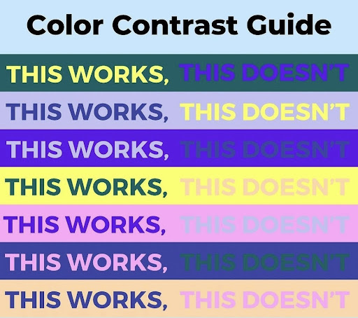
- Use sufficient contrast levels between background and text.
- Use dark coloured text on a light (not white) background.
- Avoid green and red/pink, as these colours are difficult for those who have colour vision deficiencies (colour blindness).
- Consider alternatives to white backgrounds for paper, computer and visual aids such as whiteboards. White can appear too dazzling. Use cream or a soft pastel colour. Some dyslexic people will have their own colour preference.
- When printing, use matt paper rather than gloss. Paper should be thick enough to prevent the other side showing through.
- Ensure that the graphics do not encroach upon the text & that they add to the understanding.
Layout
- Left align text, without justification.
- Avoid multiple columns (as used in newspapers).
- Lines should not be too long: 60 to 70 characters.
- Use white space to remove clutter near text and group related content.
- Break up the text with regular section headings in long documents and include a table of contents.
Writing style
- Ensure that the subject of the poster/leaflet is clear
- Make the purpose of the letter/leaflet/booklet clear in the first sentence
- Use active rather than passive voice.
- Be concise; avoid using long, dense paragraphs.
- Use short, simple sentences in a direct style.
- Use the present tense as much as possible.
- Use images to support text. Flow charts are ideal for explaining procedures. Pictograms and graphics can help to locate and support information in the text.
- Consider using bullet points and numbering rather than continuous prose.
- Give instructions clearly.
- Avoid double negatives.
- Avoid abbreviations where possible; always provide the expanded form when first used.
- Provide a glossary of abbreviations and jargon.
Audio information
Audio information is especially important for people with a visual impairment, dyslexia, learning difficulties, non-English speakers and people who struggle to understand maps; non-disabled people may also find it reassuring and helpful.
Etiquette for producing your own audio CD: use people with clear speaking voices. Give an introduction and a summary e.g. this is an annual report of 20 pages. Have gaps between sections; state page number at appropriate points so that people can retrieve information; give contact details at the end; if pictures are important to the text describe them. Allow time for taping to be done in stages so that the reader does not sound bored.