Optimal layout tips for phones
Sending test emails to yourself and reading them on your phone, is the best way to experience how a large proportion of your readership will be viewing your email.
Things to consider:
- Emails look WAY longer on a phone, especially if people have smaller phone screens, or the font sizes set to larger sizes.
- Make your main CTA (your call to action) high up in your email, ideally the first link in your email - so people aren't scrolling to get to the button or main link you want them to click on.
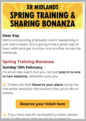
Here is an example of what an email looked like when viewing on a phone - all the information is visible as soon as you open the email. This is done by keeping the word count low and the top image height small.

