Optimal layout tips for phones
ThisSending advicetest emails to yourself and reading them on your phone, is basedthe best way to experience how a large proportion of your readership will be viewing your email.
Things to consider:
- Emails look WAY longer on a
singlephone, especially if people have smaller phone screens, or the font sizes set to larger sizes. - Make your main CTA (your call to
actionaction)email.highThisupisinanyour email, ideally the first link in your emailyou-aresosendingpeopleoutaren'twithscrolling to get to theclearbuttonpurposeortomaininvitelinktheyoureader to...attend an eventdonate to a fundraiserleadwant them toanclickAction Network form (for example to complete a survey)lead them to a webpage with more detailed contenton.
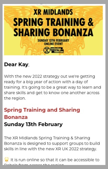
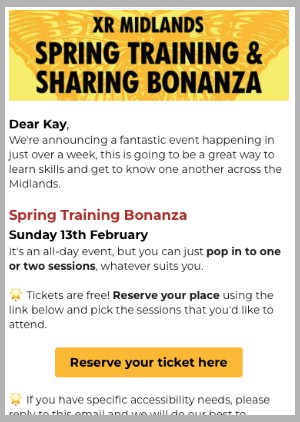
Basically the main mission for the email is to make them understand the topic/event/requirement in as few words as possible and then click through to something else.Here is an example of what an email
based on a single call to action:
whenFirst draftlooked likethis...
allBut the 'call to action' button is not visibleviewing on a phonewithout-scrolling.Sotheafterinformationmakingisavisiblefewaseditssoonincludingasreducingyouaopenfewthefontemail.sizes,Thisremovingisadonegapbybetweenkeeping1stthe word count low andsecond line, shorteningthemaintoptitle in red so it didn't wrap. Reducing theimage heightof the image and also adding to bold text to allow the skim reader to go from image to bold text to button and still understand what they are clicking on...Final verson was thissmall.


