How to take great photos
Content
In a great image, a viewer can immediately get the message you want them to understand without reading any supporting text.
What story does your image tell? What energy does it convey, what emotion? Think of these elements when taking photos.
Top Tips
-
Clean the lens on your mobile phone/camera!
-
Decide whether you are taking a photo of a person or a scene. If a person, get in close. If a scene, try to include something that shows the location to the viewer, e.g. a group photo that also shows some detail of the court building.
-
If lots of people, try to capture the scale of the action. Move somewhere higher to get a shot of a long march, or big occupation.
-
Try not to be in too-bright light that’s casting shadows over people’s faces.
-
If you are photographing an individual, where are they looking? What is the mood?
Messaging
Is there a placard or banner that conveys the central message of the action? Make sure it's readable, get close enough for it to be a strong element in the photo, check for shadows, don't cut the last letter off the banner.
Make sure there is nothing that conveys a message you don't want to put across - beware offensive t-shirt slogans, branded clothing that doesn't support our message, or words/gestures/activities in the background that detract from what XR is trying to achieve.
Arrangement of elements
Do some directing - can you rearrange the scene to get placards/banners facing camera, matching coloured flags. If many flags and no wind ask people to gently wave the flags to capture the XR logo. Perhaps take time to set up a posed group photo, giving more time to control the shot.
Distractions
Watch out for distracting elements coming into the frame such as other people's limbs or overpowering architectural features. Look at the whole frame when taking the shot. What story does the background tell? Does it distract from your subject?
Everything in the photo potentially conveys a message and even a simple thing like a disposable coffee cup has led to criticisms of Rebels. Yes, these criticisms are unfair but they are also easily avoided and distract from conveying our message.
Quality or quantity?
Take more photos than you think you’ll need - BUT only upload the good ones to Telegram and Pics.io.
One great shot is worth one hundred mediocre images, so be judicious in your selection!
Image quality
Set your camera or phone to shoot the highest quality at 300 dpi (if the option is available, not all phones have in-depth settings for photography).
Use the format you want to shoot, but make sure to convert your photos to JPEG (if they are not already) before sharing them with others (Telegram or Pics.io).
Composition
Rule of thirds
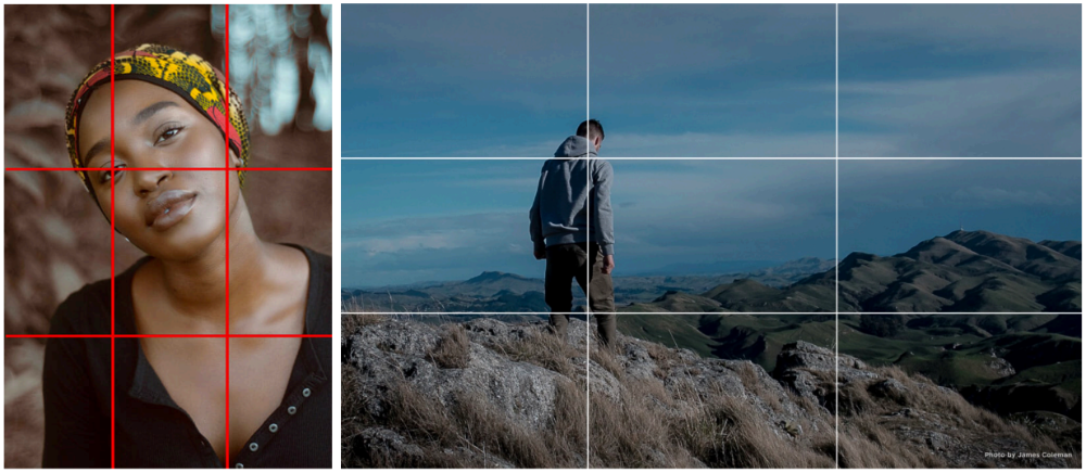
One popular guide for thinking about composition is called the 'rule of thirds'. The frame is divided into three parts horizontally and vertically so we get a grid as below:
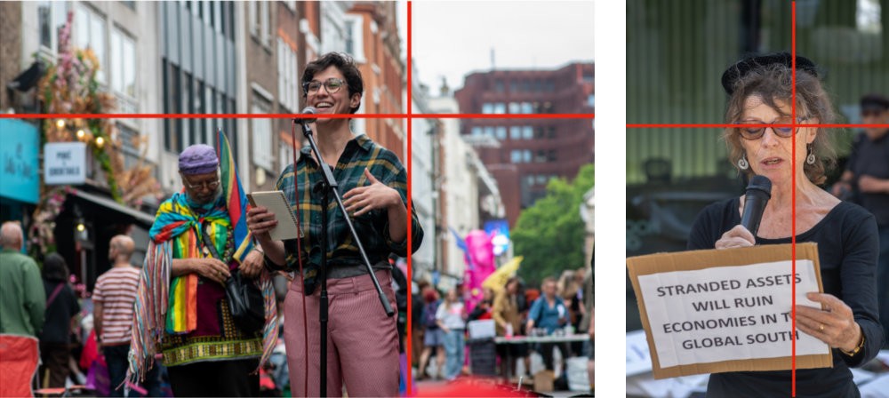
Where the lines cross are ideal placement points for the subject/person you want the eye to be drawn to.
You can place your subject along one of the thirds, so place a person being photographed to the right or left, not the centre.
If something in your photo makes a horizontal line such as a horizon, make it level with one of the horizontal lines.
It looks better to the eye than if it goes across the centre of your image.
Examples
Background
Plain backgrounds rarely look best. Pull the subject away from the background where possible.
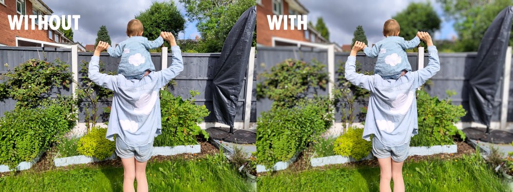
You can blur the background using the "portrait mode" on your phone. Don't abuse it as it works better on some photos than others (you can see below that it's not blurry between the arms of the subjects for example so keep this option for a subject who is standing still).
Photos against a wall look better at a 45degree angle:
Portrait or landscape?
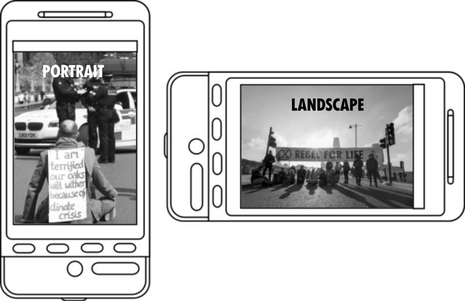
As these terms are not self-explanatory for everyone, here's a graphic:
When in doubt, take your pictures in landscape format as they can easily be cropped in portrait format should you need it (for social media for example).


