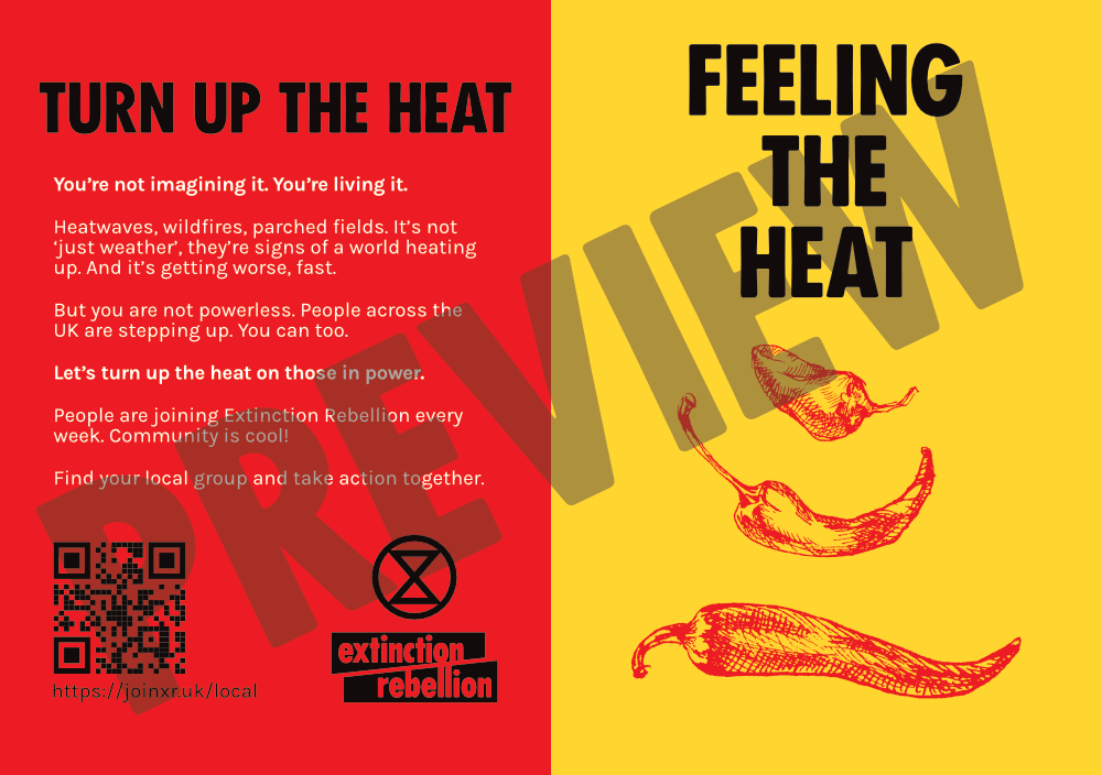
Guidance on creating flyers
Flyers are a great way to connect with people in your community — whether you’re promoting a talk, an action, or just helping people find out about XR.

Before You Start: What’s Your Purpose?
Decide on one clear goal for your flyer. Are you trying to invite people to an event, get sign-ups for your mailing list, encourage people to join your group? Pick one and make it the focus. Your whole flyer should be focused on achieving that goal.
How to make sure your flyer gets read
Keep it Short & Focused
- Aim for no more than around 6 sentences across the flyer. People won’t read much more and giving yourself a limit focuses the mind.
- Prioritise what’s essential. Less text = more attention.
- Most flyers are A5 double-sided, an A6 (half the size) can also work nicely too.
One Clear Call to Action
- Tell people exactly what you want them to do, e.g. “sign up”, “come to this talk”, or “join our group”.
- Avoid giving multiple options. People get choice paralysis and won’t do anything.
Use a QR Code (But Use it Right)
- Link to a next step - usually a sign-up form so we can contact them to follow-up.
- Avoid QR generators that use branded short links as they often expire or break, use XR's own generator!
- Include a short text version of the link underneath for accessibility and backup.
- Test your link on multiple phones and browsers.
Make It Easy to Read
- Consider accessibility for people with dyslexia, sight issues, and generally making it easy to understand.
- Use high contrast colours: dark text on a light background (or vice versa).
- Use fonts sparingly, avoid decorative fonts. XR’s Fucxed Caps font for headings only, and Karla or similar sans-serif font for main text.
- Use short sentences.
- Avoid italics, only use bold sparingly to highlight key words.
- Left-aligned is best. Avoid centre or fully justified blocks of text, it’s harder to read.
Keep Layout Simple
- Make sure the key info stands out, think: what, when, where, why.
- Use headings, short paragraphs, or bullet points to break things up.
- Avoid busy backgrounds that make the text hard to read.
- Use graphics or photos (with permission) to highlight your point.
❌ Common Mistakes to Avoid
- Too much information: Don’t try to say everything. Give just enough to spark interest. People can talk to you or visit your link for more information.
- No clear next step: If people aren’t sure what to do, they won’t do anything.
- Unreadable text: Fancy fonts, low contrast, or cluttered layouts can ruin a good message.
- QR code issues: A broken or expired link makes your whole flyer useless.
Printing Tips
- We often use Solopress for printing – reliable, good value and offers recycled paper.
- Do consider local printers! Building a relationship with them may be useful.
Helpful Tools & Resources
- You can use the free design tool Canva
- There is the XR created flyer and poster generator on Aktivisda
- As well as ready made flyers you can download from the Rebel Toolkit
Need Help?
We are here to help with flyer ideas, reviewing drafts, or finding design support. Please reach out — we want your work to have the biggest impact possible!
You can contact the UK Outreach team via our Mattermost reception or by email at actions.outreach@extinctionrebellion.uk.
